Related
Schiff: Worse Than Holding Dollars Is Holding Bondshttp://www.safehaven.com/article-6367.htm
---
Nov 30, 2006
By Bonddad, bonddad@prodigy.net
The bond market and the stock market are sending contradictory signals about the next 12 months. The stock market is essentially buying into the Goldilocks scenario – that the economy will slow gradually but will not fall into a recession. The bond market is saying a recession has a higher probability of occurring. There is enough information for both markets to maintain their respective viewpoints for now. Only time will tell which outlook is fundamentally correct.
First, here is a chart from the MarketGuage website – which is a great site for basic market information.
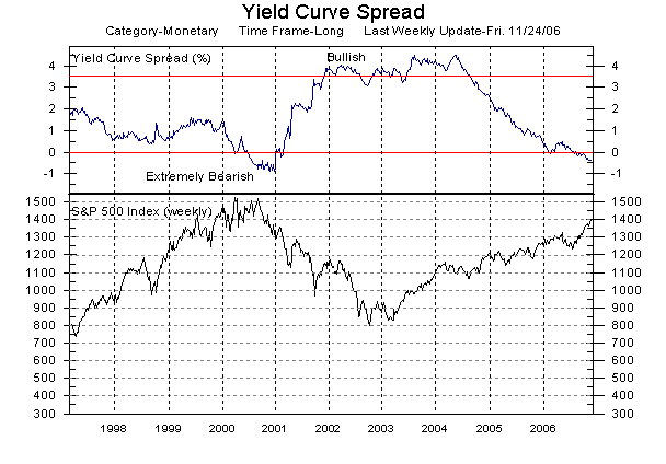
The top line outlines the difference between the ten-year Treasury bond and the 3-month treasury bone. This is called the "spread". Before we get into what this spread says, let’s go over some yield curve basics.
A "normal" yield curve (if there really is such a thing) slops from the lower left to the upper right of a bond yield chart. Here is an example from yesterday’s chart of the Japanese bond market from Bloomberg.
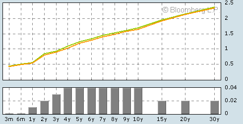
This graph says a couple of things to an economist. First, the risk associated with longer-term investments is greater than shorter-term investments. This is the natural state of yield curves because there are more things that could go wrong in the long-term in the short-term. Suppose you lent someone money for 6-months and assume they are a good credit risk. There are fewer bad things that can happen to that person to prevent them from paying you back your money. However, if you lent them money for 30-years, there is higher chance that something will happen to prevent them from paying you back. The time horizon is simply too long to calculate all of the negative possibilities. Therefore, you charge a higher interest rate to compensate for the increased risk.
Secondly, this graph says that inflation expectations are higher. It’s important to remember the real rate of return on a bond is the bond’s interest rate minus the prevailing rate of inflation. If traders think inflation is headed higher, they will demand a higher interest rate so they can make more money. Here it’s important to remember that a bond’s price and yield are inversely related: as prices decrease, the interest rate increases and visa verse. So, on the Japanese chart investors are selling the long bond (or at least not buying it), driving longer-term interest rates higher.
Finally, this graph says bond market traders are expecting an increase in interest rates – or, more generally, that the probability of interest rate increases is higher than interest rate decreases. Here’s the reason. If interest rates increase in this environment, people who hold longer-debt will lose money because interest rates across the board will probably increase in one degree or another.
Now, let’s literally reverse everything that’s been said above, with a few changes. First, let’s make the possibility of a rate decrease the most important factor when buying a bond, followed closely by decreased inflation expectations (or reverse them). That would describe the current US yield chart which looked like this at about 3PM EST.
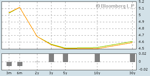
The above mentioned factors – a decrease in inflation and a decrease in interest rates – are two important factors that happen in an economic slowdown. The central bank lowers interest rates to stimulate borrowing and thereby increase economic activity. Inflation decreases (usually) because there is less demand for products, which lowers the possibility of demand-pull inflation. The general decrease in economic activity lowers the amount of goods business produces, which lowers the purchase of raw materials, which lowers cost-push inflation pressures. Anyway, that is the basic line of thinking involved with the current US yield chart.
Now, let’s turn to the stock markets, which have all enjoyed a rally starting in July of this year (this chart is from the Martindale Capital Website which has some great charts.)
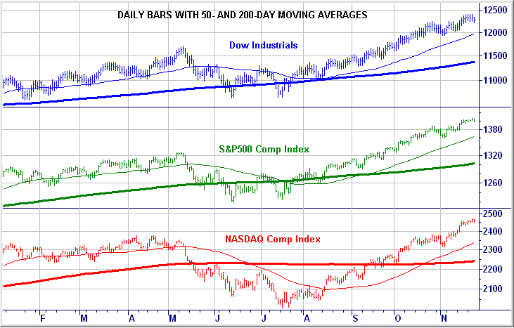
All three averages have increased since July. Stocks increase when business conditions are good and stocks decrease when business conditions are bad. The latest earnings season was good for stocks. While GDP has slowed it has not gone negative. The latest inflation gauges have shown a decrease in inflation, meaning the Fed doesn’t have to increase interest rates (at least right now). Basically, traders think the economy will have a soft-landing. This means that growth will slow, inflation will slow, but the economy will not contract. In the words of most Federal Reserve bankers, the US economy will not operate at full capacity, but operate below full capacity.
So – who is right? We won’t know until the economy gives a firm set of signals in either direction. However, it’s important to note there is enough evidence for both markets to take their respective positions.
No comments:
Post a Comment